If your service pages are not producing quality enquiries, the issue is usually not design polish. It is messaging architecture.
Many SMB pages list features, add a contact button, and hope intent carries the rest. But buyers need clarity. They need to know what problem you solve, whether you are credible for their context, and what happens if they take the next step.
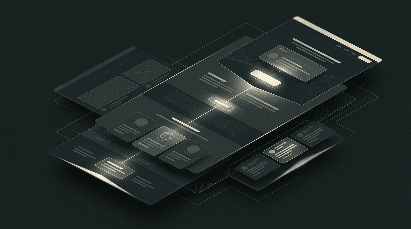
This framework helps you build service pages that do exactly that. It is intentionally practical so owners and lean teams can implement without months of rework.
What a service page must do to convert
A strong service page has one core job: move a relevant visitor from uncertainty to qualified action.
To do that, it must answer:
- Is this service for my specific situation?
- What result should I expect and on what timeline?
- Why should I trust this provider over alternatives?
- What is the next action and is it worth taking now?
If a page fails any of these, conversion drops.
The 9-block service page structure
Use this order because it matches how buyers evaluate risk.
Block 1: outcome-focused headline
Skip vague taglines. Use a direct statement:
"[Service] for [audience] that need [outcome] without [friction]."
Supporting line should add specificity:
"We help [audience] solve [problem] with [approach], typically in [time window]."
One primary CTA only.
Block 2: "is this for you?" fit criteria
This is a qualification accelerator. List buyer scenarios where your service is most valuable.
Example:
- your inbound leads are rising but quality is inconsistent
- your sales team repeats the same pre-qualification questions
- your website traffic does not convert into pipeline
This section makes good-fit visitors feel seen.
Block 3: the problem-cost section
Most owners underestimate the hidden cost of doing nothing. Quantify impact in plain language:
- lost enquiries from weak conversion paths
- ad spend wasted on low-intent clicks
- slow sales cycles from poor expectation setting
When buyers understand cost clearly, urgency rises.
Block 4: your method in 3-5 steps
Buyers do not need every internal detail, but they need confidence in your process.
Use named phases:
- Diagnose and prioritize.
- Build and implement.
- Measure and optimize.
For each phase, include deliverables and practical outcomes.
Block 5: scope and boundaries
This is one of the most important qualification sections. Clarify what is included and what is not.
It prevents poor-fit enquiries and reduces proposal friction.
Include:
- typical project scope
- timeline ranges
- required client inputs
- exclusions or add-ons
Serious buyers appreciate transparency.
Block 6: proof that matches context
Generic testimonials are weak. Use proof linked to similar use cases:
- concise case snippets with measurable outcomes
- quote + context + what changed
- before/after process improvements where accurate
Do not hide proof in a separate page only. Place it near decision points.
Block 7: objections and decision questions
This section reduces friction before contact.
Answer practical questions:
- "How quickly can we start?"
- "What if we already have internal tools?"
- "How much input is needed from our team?"
- "How do you handle handover and support?"
Clear answers improve lead quality and call readiness.
Block 8: offer framing and CTA
Your CTA should reflect buyer stage and intent. For problem-aware traffic, use action language:
"Send your project details for a tailored next-step plan."
Add response expectation:
"You will hear back within one business day."
This simple addition increases submission confidence.
Block 9: related resources and internal links
Link to:
- relevant insight article(s)
- process page
- contact page
This supports both crawlability and user progression.
Copy principles that increase conversion quality
Use these writing rules across the page:
- Write to one audience at a time.
- Replace abstract claims with concrete outcomes.
- Keep sentence length short for scanability.
- Use minimal jargon unless your buyer expects technical depth.
- Show confidence without making unrealistic promises.
A practical, direct tone builds trust faster than marketing-heavy language.
The trust stack: what to show and where
Trust should appear in layers throughout the page, not one logo strip at the bottom.
Recommended trust stack:
- immediately under hero: short credibility statement
- after method section: case snippet with outcome
- near CTA: social proof and risk-reducing notes
- footer area: compliance, credentials, partnerships where relevant
This sequencing supports buyer psychology from attention to decision.
Conversion friction audit for service pages
Run this checklist monthly:
- Is the primary CTA visible without scrolling?
- Are there conflicting CTAs that dilute action?
- Is mobile readability strong across all sections?
- Are forms short enough for first intent capture?
- Are response expectations explicit?
- Are trust signals near high-friction moments?
If any answer is no, prioritize fixes before investing in more traffic.
Owner-level metrics to track
You do not need a complicated analytics stack to improve results. Track:
- Service page views from qualified channels.
- Click-through to contact page.
- Contact submission rate from service pages.
- Qualified-lead ratio of submissions.
- Enquiry-to-opportunity conversion.
These metrics show whether your page is attracting the right people and moving them forward.
30/60/90-day service page improvement roadmap
First 30 days: establish clarity
- Rewrite headlines and outcomes on top service pages.
- Add fit criteria and problem-cost sections.
- Simplify CTA path and form fields.
- Add one high-relevance proof snippet per page.
Expected impact: stronger message-match and better conversion quality.
Days 31-60: strengthen trust and routing
- Expand proof with context-specific outcomes.
- Build objections section from real sales-call questions.
- Add internal links to insights and process pages.
- Improve mobile content hierarchy and CTA visibility.
Expected impact: lower friction and more informed enquiries.
Days 61-90: optimize by data
- Compare conversion rates across service pages.
- Replicate top-performing sections/copy patterns.
- Remove sections with high scroll drop-off.
- Refine CTA language based on lead quality.
Expected impact: compounding gains in qualified lead generation.
Common mistakes that reduce service-page ROI
Avoid these:
- designing before defining outcome messaging
- writing for "everyone" instead of ideal buyers
- overloading pages with technical detail early
- hiding pricing approach or scope boundaries
- asking for too much too soon in forms
Practical clarity beats complexity almost every time.
Quick self-assessment template for owners
If you need a simple way to evaluate one service page this week, score each area from 1 to 5:
- Message clarity in first screen view.
- Buyer-fit specificity and relevance.
- Outcome framing versus feature listing.
- Proof quality near decision points.
- CTA clarity and friction level.
Then apply this rule: any section scoring 3 or below gets rewritten before you invest in additional traffic. This creates a practical optimization order and prevents "design-first" decisions that feel productive but do not improve conversion quality. Repeat this scorecard monthly for your top pages and you will spot improvement opportunities early, before they become costly leak points.
Final takeaway
A high-converting service page is a qualification and confidence system. It tells the right buyers: "You are in the right place, we understand your problem, and here is the next logical step."
Build pages this way and your website will stop generating random enquiries and start producing serious conversations.
Want help applying this framework to your top offer? Share your current service page and goals through our contact form, and we will show the priority changes first.